Rethinking the EV Charging Experience with AI
Originally published on Medium: https://medium.com/design-bootcamp/rethinking-the-ev-charging-experience-with-ai-31ab1ee678ea?source=rss-6c5be1f9757d------2
An AI-Driven Product Strategy for In-App Charging Decisions
Self-initiated case study · Prepared for Tesla(China) PM final-round interview · 2026
Quiet month on Medium for me. I’ve been navigating a transition: three years into product design, I’m moving toward PM and product engineering. AI-native workflows have changed what “designing a product” even means, and I’ve realized I want to own the whole thing — strategy, design, and the build. Here’s a case study from that journey, shaped by recent interviews and coffee chats.
Overview
China’s public EV charging network has solved coverage. It hasn’t solved the experience. Drivers stand in front of a map with dozens of stations, uncertain availability, fluctuating prices, and no good way to know if they’re making the right call. I spent ~3 weeks building an end-to-end product proposal that reframes charging from an information lookup tool into an AI-driven decision system — one that proactively understands when you need to charge, why one station beats another, and how to keep the experience coherent from notification to payment.
This case study walks through how I framed the problem, the core product insight, the user journey and UI logic, the metrics I’d commit to, the technical feasibility analysis, and a four-phase rollout. It was built independently as preparation for a PM final-round interview with Tesla; no proprietary information was used, and no affiliation is implied.
1. Context & Problem Framing
Why now
China crossed a real threshold in 2024: 12.8M total charging devices, 110B kWh delivered, 38% YoY growth, and 98% expressway coverage. The conversation has shifted from “Is there a charger?” to “Is this the right charger for me, right now?”
For a vertically integrated EV manufacturer with its own car, app, supercharger network, and payment account — that integration is a structural advantage almost no other player in the ecosystem has. The opportunity window is the move from coverage-driven to experience-driven competition.
The user pain, in actual numbers
I pulled industry research from EVCIPA and the China Consumers Association and split the pain into two clusters:
Infrastructure pain (the things AI can help users avoid):
- 79.2% — ICE vehicles blocking charging spots
- ~60% — frequently encountering broken or faulty chargers
- 71.2% — concerned about unstable voltage/current
Information & decision pain (the things AI can directly solve):
- 32.4% — charger info not updated in real time
- 27.3% — station status shown inaccurately
- 24.5% — clunky end-to-end charging flow
This split mattered because it told me where the product could actually move the needle. We can’t fix a broken charger from inside an app, but we can route around it. We can fix the decision-making burden directly.
The core insight
The real problem isn’t a lack of information. It’s that the user is forced to repeatedly make complex decisions under high uncertainty, alone.
Three uncertainties show up in every charging session:
- Availability uncertainty — When I get there, can I actually charge?
- Time uncertainty — Should I wait? How long?
- Value uncertainty — Is this choice actually the best one?
Reframing the problem this way unlocked the product direction.
2. Product Vision
From information tool → decision system
Today, Proposed Information lookup, static UI AI-driven decision system, adaptive UI User filters stations, compares wait times, prices, distance, speed System proactively detects context and intent Lots of information, high decision cost Auto-generates 2–3 explainable options Pre-charging, mid-charging, and post-payment experiences are disconnected Continuous optimization across the full journey User triggers every decision Payment and perks personalize based on behavior
The shift isn’t “add AI features.” It’s a change in who initiates the decision — from user-pulled to system-pushed, with the user always retaining final control.
Personalization logic
I designed a three-layer recommendation pipeline:
- Input signals — commute frequency, historical station preferences, dwell time, click depth, current battery, route, time of day
- System priority inference — is this user currently optimizing for time, cost, or scenario fit?
- Output — recommend nearby available stations, off-peak pricing windows, or destination/long-trip plans accordingly
Adaptive information density
The same scenario should produce different interfaces depending on user behavior. I built two modes:
- Simple mode (action-oriented users): one recommendation, one big “Go now” button, two key numbers (ETA, cost), conversational rationale
- Detailed mode (data-oriented users): three-option comparison table, 8+ data points, charging power curve mid-session, data-driven rationale
This isn’t just a setting — the system learns which mode fits each user and shifts automatically.
3. User Journey
I broke the experience into five stages, each with its own AI role:
Stage 1 — Sense the Need
- Predict future trips from commute patterns
- Combine the current battery, route, and network load to recommend charging at the optimal moment
- Low-interruption push on app + real-time prompt on car display
- If the user dismisses, the recommendation persists in a dashboard for later
Stage 2 — Find & Decide
- AI generates explainable multi-option recommendations
- Dynamic ranking by available capacity, predicted wait, cost, distance
- Two UI modes: single best recommendation OR multi-option comparison
- “Why this one” rationale on every card
Stage 3 — During Charging
- Real-time progress + predicted completion
- Dynamic cost updates
- Move-your-car reminders to reduce overstay
- AI strategy hints (“12 more minutes gets you to 90% — and you’re entering off-peak pricing in 8 min”)
Stage 4 — Pay & Leave
- AI bill summary: time vs. cost vs. alternative options you didn’t take, so the user can see the value of the recommendation
- Auto-invoice and reimbursement support
- Personalized perks based on behavior
- NPS + structured feedback collection that feeds back into the model
Stage 5 — Operations Loop (back-end)
- 72-hour demand forecasting
- Dynamic pricing suggestions
- User behavior reshapes recommendation strategy and network efficiency
The reason I included Stage 5 explicitly: a charging recommendation system isn’t just a consumer feature. It’s also a load-balancing tool. The same algorithm that helps a user avoid a queue helps the network smooth out peaks. Designing for both sides at once is what makes the unit economics work.
4. Wireframes & Interaction Model
I built the full set in Figma — both car-display and mobile app surfaces, in both simple and detailed modes, across all four user-facing stages.
Key interaction decisions:
- Car display gets a 10-second non-blocking notification bar. Driving safety is non-negotiable; anything more is a regulatory and ethical problem.
- App push uses a low-interruption pattern that surfaces on the lock screen with one-tap entry into the recommendation.
- Every recommendation card has a visible “why” — one line in simple mode, data breakdown in detailed mode. Explainability isn’t a nice-to-have; it’s how the system earns trust.
- The bill screen always shows the alternative. “You saved 12 min and ¥15 vs. the next-best option.” This is the single highest-leverage screen for changing user perception of the AI from “magic” to “reliable.”
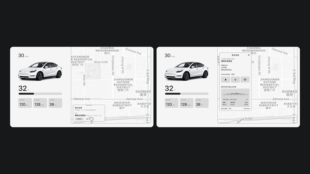
Carplay Wireframe
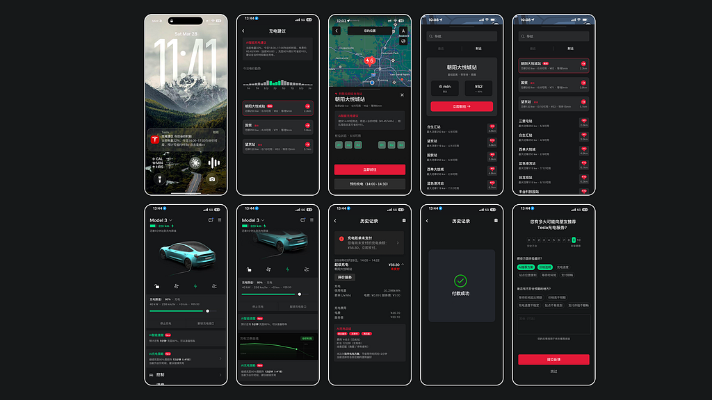
App redesign
5. Metrics & Success Criteria
I committed to specific targets at every stage. Baselines are from public industry data or marked as MVP-period TBD. Every number would need A/B validation post-launch.
Stage 1 — Sense the Need (improve reach efficiency)
- Push CTR: industry baseline 2–4% → target >15%
- Recommendation acceptance: industry baseline 20–35% → target >40%
- Dismiss rate: target <15%
Stage 2 — Find & Decide (the core stage)
- Decision time: ~5 min → 3 min (–40%)
- AI option selection rate: >60%
- Station match accuracy: >90%
Stage 3 — During Charging
- Move-your-car reminder response rate: >70%
- Overstay rate: –30% from baseline
- Charging strategy execution rate: tracked continuously
Stage 4 — Pay & Leave
- NPS: 30–40 → 45–55 (+15)
- Survey completion: industry 10–15% → >25%
Operations loop
- Peak/off-peak charging ratio: 3:1 → 2:1
- Demand forecast MAPE: <15%
- Recommendation CTR monthly growth: +2–3%
- Monthly active charging retention: ~60% → ~70%
The North Star I’d defend in a planning meeting: decision time in Stage 2. It’s the cleanest measurable proxy for the underlying user pain, and every other metric is downstream of it.
6. Technical Feasibility
I included this section deliberately because PM proposals that hand-wave the technical layer don’t survive contact with engineering. Difficulty ratings are my honest reads as someone who has shipped production frontends and worked closely with ML teams:
Module Difficulty Notes User profile model Low Behavioral clustering on existing data Real-time station data Very low API already exists Proactive trigger engine Low Rules-based on battery / route / off-peak / favorite stations Dynamic UI rendering Medium Server-driven UI via JSON config Recommendation & ranking Medium Multi-objective; rules engine for MVP, ML later Natural language interface High LLM eventually; rule + template for MVP Demand forecasting Medium Time-series methods, Prophet → LSTM ensemble
Conclusion: The MVP is buildable on existing data and infrastructure with a rules engine. ML and LLM layers come in later phases. This is the right shape for a proposal because it lets the team ship and learn before committing to expensive infrastructure.
7. Architecture (High Level)
I sketched a six-layer system:
Frontend touchpoints → API gateway → Business services → AI/ML layer → Data layer → Infrastructure
The pieces I’d flag for any PM reviewing this:
- Server-driven UI is what makes the simple/detailed mode switching possible without app updates
- Rules engine first, ML second for the recommendation ranker — buy time and data before committing to model complexity
- Edge-first privacy for behavioral data on the car-display side, falling back to the cloud where needed
- Offline graceful degradation — when there’s no network, the app falls back to cached basic recommendations rather than failing
8. Roadmap
0–3 months · MVP
- Smart recommendation card
- Rules engine
- A/B test infrastructure
- Target: card acceptance >40%
3–6 months · Recommendation engine
- Multi-option recommendations
- Real-time prediction
- Target: option selection rate >60%
6–12 months · Adaptive UI
- Server-driven UI
- Information density auto-adaptation
- Target: NPS +15, retention +10%
12+ months · AI ecosystem
- Autonomous-driving integration
- Solar-storage-charging integration
- End-to-end intelligent charging experience
9. Design Principles
These are the constraints I’d hold the team to throughout:
- AI assists, never replaces. The user always has a choice. Recommendations are recommendations, not decisions.
- Progressive personalization. New users get sensible defaults. The system gets better with use, not worse.
- Explainability by default. Every recommendation comes with a reason.
- Privacy-first. Edge processing beats cloud processing wherever feasible.
- Offline-graceful. Local fallback when the network drops.
10. What I’d Do Differently
A few things I’d push back on if I were doing this for real, post-interview:
- The metrics need real baselines. I used industry numbers and reasonable assumptions, but a real version of this needs the company’s internal data. The honest answer to “what’s our current decision time?” is “we don’t know — let’s instrument it first.”
- Stage 1 is the riskiest stage. Proactive notifications have a hard ceiling on user tolerance. I’d want to A/B test interruption patterns before scaling.
- The simple/detailed mode split is a hypothesis. It might turn out that users want one mode 90% of the time. I’d validate with a smaller two-arm test before building the auto-switching logic.
- I under-weighted the operations side in the original deck. A second pass would put more space on how Stage 5 (the back-end loop) directly affects Stage 2 (recommendations) — that closed loop is the actual product moat.
11. Reflection
The deepest thing I took away from this exercise: the most valuable PM work in mature consumer products is reframing, not feature-building. The charging app already had every piece of information the user needed. What it didn’t have was an opinion. Adding an opinion — an explainable, accountable, dismissible opinion — is what moves the experience from “tool” to “service.”
That framing applies far beyond EVs. Any product where users face a decision under uncertainty with too much information and too little context has the same shape, and the same opportunity.
Built in Figma with Claude as a research and writing collaborator. All wireframes, system diagrams, metrics analysis, and the source presentation are my own work. This case study uses no proprietary information from any company and is not affiliated with or endorsed by any EV manufacturer.
Rethinking the EV Charging Experience with AI was originally published in Bootcamp on Medium, where people are continuing the conversation by highlighting and responding to this story.