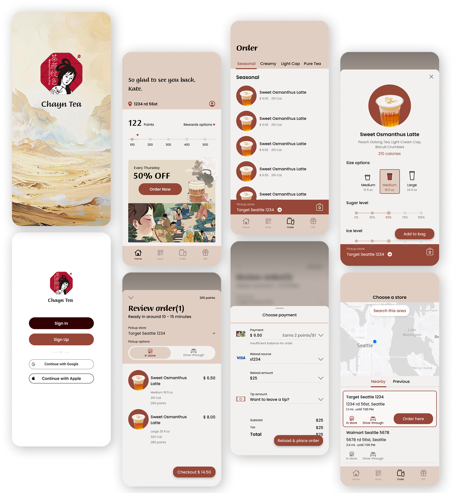
Milktea Digital Journey:
Transforming Tradition into a Daily Ritual

Bringing Chinese tea culture to the North American digital world.
As the sole UX designer on this project, I led the end-to-end redesign of Tea Yan Yue Se’s digital ordering platform over a 6-week sprint. The goal was to streamline the user journey, improve mobile ordering conversion rates, and prepare the system for global rollout — especially targeting North American users. I drew UX inspiration from platforms like Amazon Fresh to align with local e-commerce habits while preserving the brand’s cultural identity.
Background
Over this design sprint, I led the UX redesign of a Chinese milk tea brand’s online ordering experience, with a focus on international expansion.
My goal was to simplify the mobile ordering flow, increase conversion rates, and adapt the experience for North American users.
The redesign responded to two key business needs: rising demand for healthier drink options and the need to localize for global markets.
Challenge
The challenge of this project was to help Chayn adapt its user experience to a new market, ensuring it aligns with both local preferences and the brand’s identity while driving international growth.
What I did?
💻 Landing Page: Branding & User Growth
Designed a brand-focused landing page for the North American market
Combined traditional tea culture with a modern visual style
Structured content to highlight products and drive sign-ups

📱 App: Online Ordering Experience
Designed a streamlined mobile ordering flow
Enabled full drink customization (sweetness, toppings, ice level)
Simplified checkout with Apple Pay and Google Pay
Added onboarding and rewards to increase engagement

🚗 Drive-through: Pickup Experience
Mapped user journey from order to pickup
Designed real-time order tracking and QR code check-in
Improved signage and pickup flow for a smooth drive-through experience
Reduced wait time and confusion during peak hours
User Research
To understand user expectations around mobile ordering and drive-through experiences, I conducted secondary research focusing on leading platforms such as Amazon Fresh, Starbucks, and McDonald’s.
I analyzed their information architecture, customization flows, checkout speed, and localization strategies.
🧠 How I Used These Insights:Drawing from these comparisons, I prioritized:
A fast and intuitive mobile flow (inspired by McDonald’s pickup model)
Simplified product organization and checkout (like Amazon Fresh)
A brand-expressive but user-friendly UI (adapting Starbucks' storytelling and customization UX)

Q1
How might we introduce a culturally rooted Chinese tea brand to a Western audience - and make it feel both authentic and approachable?

🎯 What I Did
Designed a modern, culturally relevant landing page
• Focused on brand story, visual identity, and user growth
• Supported SEO and structured content for conversion

Q2
How might we make online ordering intuitive and delightful, while respecting users’ preferences for drink customization?

🎯 What I Did
Built a mobile-first ordering flow
• Enabled drink customization and gamified rewards
• Simplified checkout UX

Q3
How might we make the pickup experience fast, clear, and enjoyable — even for first-time drive-through users?

🎯 What I Did
• Mapped user flow from app to car
• Designed real-time order status and QR check-in
• Improved signage and pickup instructions
• Reduced wait time and confusion