LUNA: Mobile App for Women's Health
Designing a mobile app for women's health that provides personalized health insights and wellness recommendations.

Overview
LUNA is a mobile health experience that rethinks how users interact with personal body data. Instead of focusing on static metrics like weight or BMI, the project explores how mobile interfaces can translate complex health signals into intuitive, emotionally supportive interactions.
This case study highlights my mobile interaction design approach and complements my recent work in adaptive web and e-commerce products.
My Role & Ownership
End-to-End Product Designer
- Defined product direction and UX strategy
- Led interaction design and mobile information architecture
- Built the visual system and component patterns
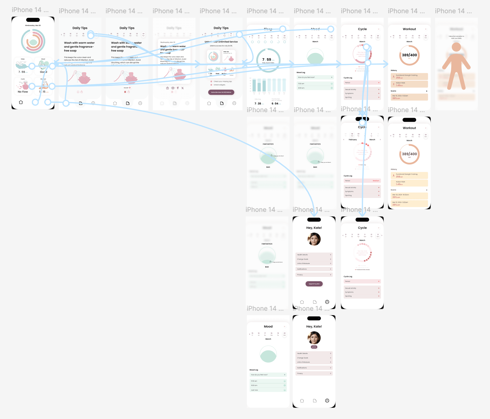
- Created prototypes and iterative interaction flows
As the sole designer on this project, I owned both product thinking and execution — balancing usability, clarity, and emotional experience within mobile constraints.
Problem Framing
During early research, I observed a recurring issue across existing health apps:
Users are surrounded by numbers but lack understanding.
Common friction points included:
- Metric-heavy dashboards that increase cognitive load
- Progress tracking that feels judgmental rather than supportive
- Lack of contextual guidance for daily decision-making
- Mobile interfaces optimized for data display instead of interaction
Design Question
Product Thinking
Rather than designing around data inputs, I reframed the product around context-aware interaction.
Core hypotheses:
- Visual interpretation reduces mental effort more than numerical comparison
- Progressive disclosure works better than dense dashboards on mobile
- Emotional tone influences long-term engagement in health products
This shifted the project from a “tracking app” toward a guidance-oriented experience.
Key Design Decisions
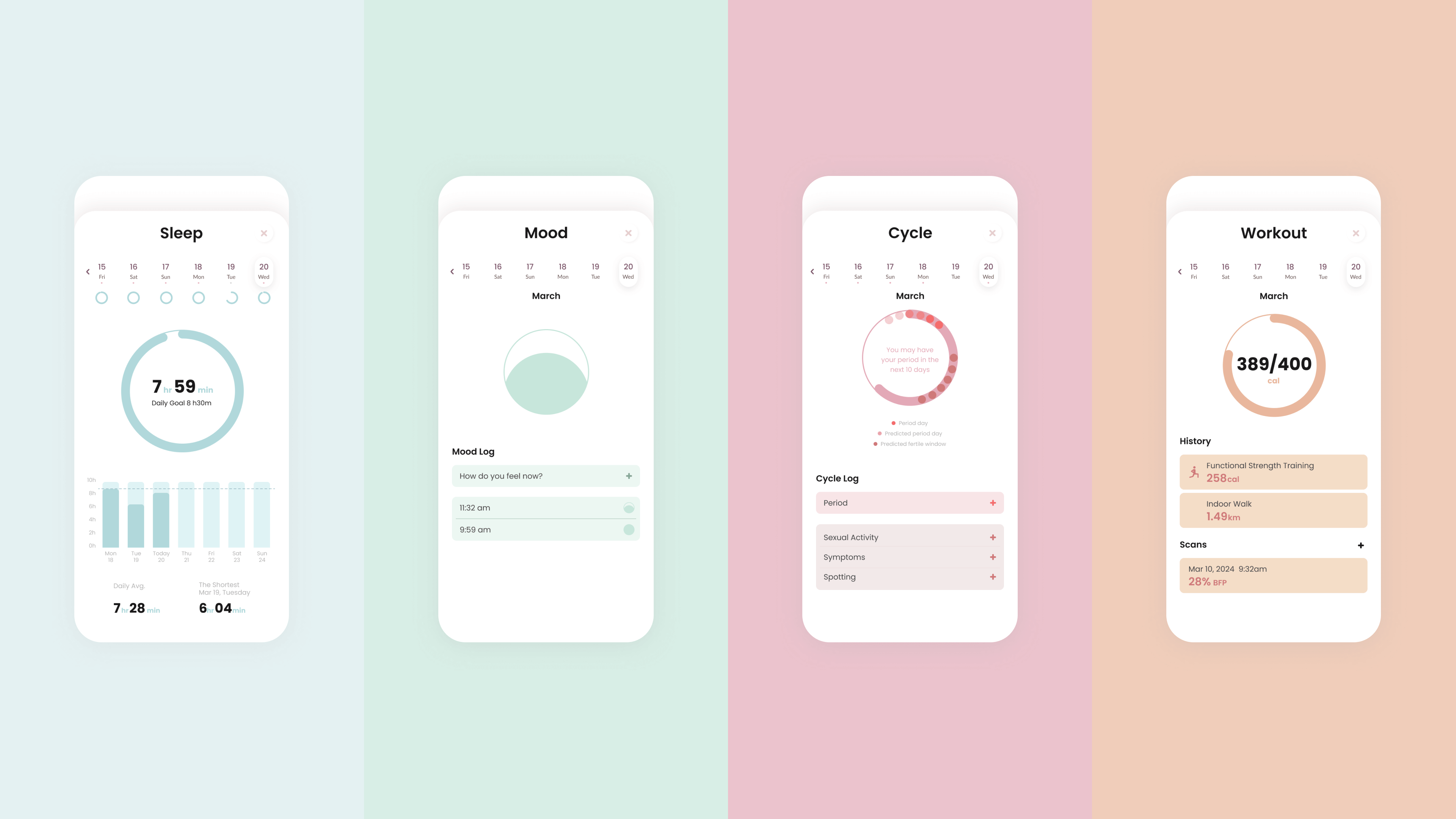
Adaptive Dashboard Instead of Static Metrics
Most health apps present all metrics simultaneously.
I redesigned the home experience as a modular dashboard that surfaces only relevant insights based on user context.
Design trade-offs:
- Reduced information density to improve focus
- Prioritized interaction flow over raw data visibility
- Created flexible card components for future scalability
Impact:
Users can quickly understand their current state without navigating multiple screens.
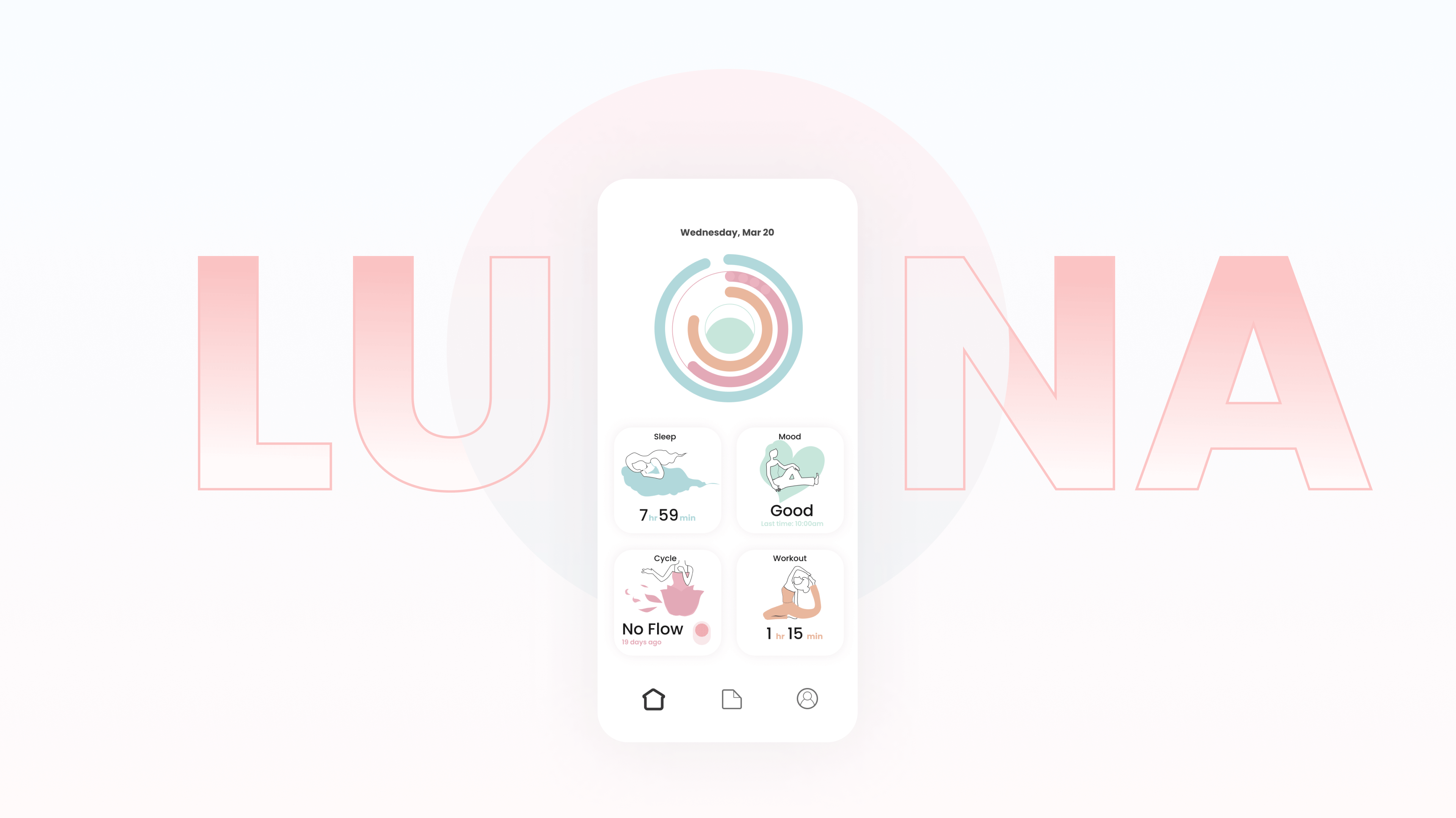
Visual Body Awareness Model
Instead of traditional charts, LUNA introduces simplified visual progress representations.
Why:
Numbers alone create comparison anxiety. Visual abstraction allows users to understand trends without judgment.
Design considerations:
- Avoid hyper-realistic visuals that could trigger negative self-perception
- Maintain clarity while keeping the interface emotionally neutral
Constraints & Trade-Offs
Designing for mobile required continuous prioritization:
- Limited screen space forced stronger hierarchy decisions
- Simplification meant intentionally hiding certain data layers
- Emotional tone had to balance encouragement without being overly prescriptive
These constraints shaped my approach to building adaptive interfaces — a mindset I now apply across both mobile and web products.
Outcomes & Learnings
While LUNA began as an exploration project, it became a turning point in how I approach product design:
- Interaction clarity often matters more than feature quantity
- Context-aware UI can reduce user effort significantly
- Designing emotional systems requires as much structure as visual design
This mobile experience directly influenced my later work in adaptive dashboards and AI-assisted product interfaces.
Reflection
Although much of my recent work focuses on large-scale web and e-commerce platforms, LUNA represents an important foundation in mobile interaction thinking.
It shaped my approach to:
- Context-aware systems
- Adaptive UI patterns
- Designing beyond traditional dashboards